Mockup Monday #41:
Consistent Style Is Better Than A Few Good Assets
Mockup Monday #41:
Consistent Style Is Better Than A Few Good Assets
May 4, 2015
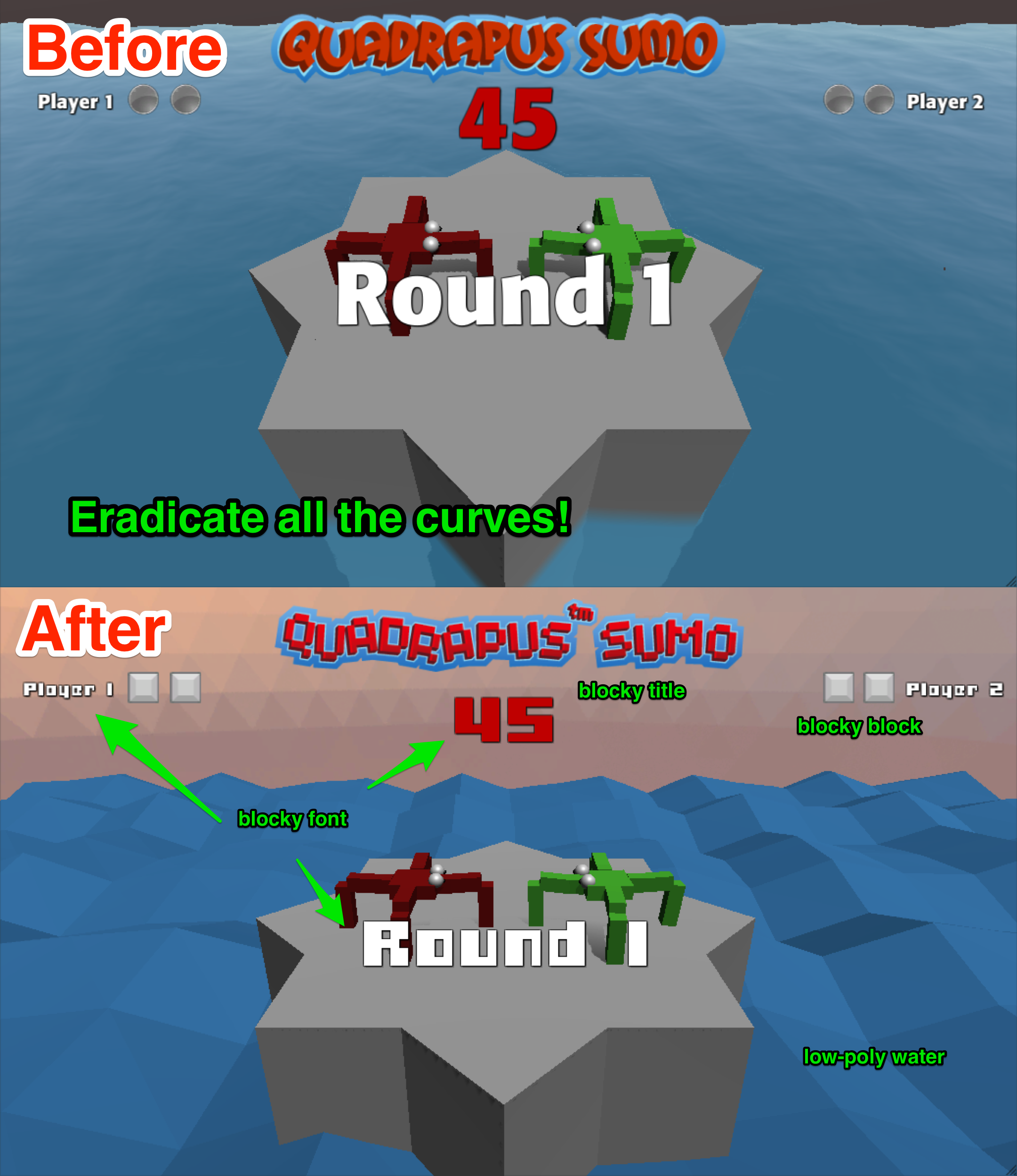
I’ve been trying to normalize Quadrapus Sumo‘s art style, trying to make it consistent. I’m a fan of low-poly art, and the sumo characters themselves are made of blocks, so I decided I would try to eradicate all curves from the game’s presentation as my first consistency rule. This was not easy because a couple of cases I felt like I was degrading individual assets, and perhaps I was.
Consider the water shown in the before and after picture. The water in the before picture is great. It’s got waves and refraction of the stage. But it actually looks too good. It’s out of place compared to my quadrapuses. So I replaced it with some low-poly water. It still has waves and dynamicism but there’s no refraction, but it fits!
Likewise, I changed Quadrapus Sumo’s title graphic. I’m no graphic designer, but I can follow a tutorial, which is how I made the original title graphic. This time I did a combination of that and this blocky tutorial. This was again difficult because there is something very nice about the curves and feel of the original. The new one I honestly don’t like as much, but I’m hoping I come to like it more.
Some smaller changes I made were to swap out the skybox, change the win decals from circles to boxes, change the font to something blocky. Some of these changes feel like improvements or neutral, but the ones that feel worse are difficult to do.
It’s difficult to purposefully “degrade” assets to get them to fit within the same style, but it’s important that they fulfill what’s required for your game more than any individual merit they have on their own. I remember an English teacher in college providing this strange advice: “If you think you’ve written a passage that’s absolutely brilliant, do yourself a favor and throw it away.” The reasoning was that once you’ve developed that emotional attachment, you’re not going to be able to edit that line to fit within the broader piece. What if it’s actually unnecessary to the piece, will you delete it or will you find an excuse to keep it in?
This article by Joost van Dongen touches on another aspect of having to “degrade” assets to suit the game’s needs: desaturating backgrounds or keeping them in a different style than characters and active elements of the game.
